What’s the value of your visual identity?
Identity Crisis
Is your visual identity worth investing in? What’s a good first impression worth to you? A first impression is a one-shot deal, but for a lot of businesses, design is an afterthought at best, a pain in the ass at worst. But what about when it’s neglected? You can make the argument that many successful businesses have a minimal marketing budget even less focus on design—you wouldn’t be wrong.
But don’t let that fool you into thinking that a well-designed brand identity doesn’t give you a big boost in the market—because it absolutely does.
Business owners have a million and one things on their plates—budgets to juggle, people to manage—and are constantly working on how to triage everything about growing their company. Logos and other visual elements are only important once they begin to see how well-designed brands can elevate them and effectively make them more money and improve their reputation.
Yes. A good logo, as part of a strong overall brand experience, can add to your bottom line. Even science proves it. Here’s how:
What our brains have to do with it
Logos, images and color reinforce memory by providing a visual “imprint” for customers—an idea that has been validated by science. Providing visual cues for memory has proven to be vital not only in branding and marketing, but in learning just about anything.
Dr. Paul Martin Lester’s study, “Syntactic Theory of Visual Communication” demonstrated that people only remember 10% of what they hear and 20% of what they read, but about 80% of what they see and do. “Vision trumps all other senses,” according to John Medina, author of “Brain Rules”. He says, “If you hear a piece of information, three days later you’ll remember 10% of it. Add a picture and you’ll remember 65%.”
The consensus among psychologists is that people like what they know. So reinforcing memory with visuals and helping customers create a positive correlation between a logo and a brand can go a long way toward building brand loyalty.
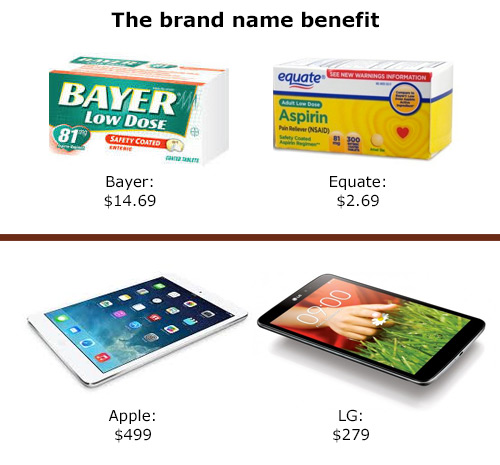
Why is this important? To demonstrate the value of brand names, New York University’s professor of finance Aswath Damodaran, compared companies making similar products: Apple and Dell, Honda and Ferrari, and notably Coca-Cola and Cott, makers of RC Cola. “Soda is water with a bunch of sugar and a lot of crap thrown in,” he said. “You can put whatever you want on the outside of the can, but there is really no difference between a cola and another cola. You may say that Coca-Cola tastes different — that’s what 100 years of playing with your mind does to you,” he stated.

The conclusion? Greater success in the cola business is about brand, not product. Damodaran valued Coca-Cola at $79.6 billion, compared to Cott, which was only $15.4 billion. The difference between the two is a whopping $64.2 billion—a serious brand name premium. If you think about it, that means that only something like 20% of Coca-Cola’s value is the product, while the balance is the equity—the premium price—garnered by their brand name and how it is viewed in the market.
What is a brand?
Your “brand” is what your customer thinks about when she hears your brand name. Brand is reputation. It’s how someone feels when he thinks about your products. Your visual identity is an important trigger to help customers remember and identify with your brand. Milton Glaser, the legendary graphic designer best known for the “I Love New York” logo, says that it has to do with simplicity. “You want to move the viewer in a perception so that when they first look at [the logo]…they get the idea, because that act between seeing and understanding is critical,” he said.
Characteristics of a strong visual identity
While there isn’t a set-in-stone rulebook for what makes the perfect logo or visual identity, there are a few things the best of them have in common. How does yours hold up?
1) Does it convey the right message and differentiate you from your peers? Is it serious when it should be fun, haphazard when it should be polished or does it reach that target perfectly? Use your visual identity to reinforce your brand promise. It needs to harmonize with all of your messaging.
2) Does it convey professionalism and trust? Is it appropriate? Does it make sense to your target audience? Most folks are unlikely to bank with a financial institution called “Fred’s Bank” with a logo of a cartoon dollar sign and a tagline of “Give us your money—we like money!” That’s not exactly trust-inspiring. But parents might like that exact same whimsical approach for a kid’s game for learning about money. Know your market and make sure you’re speaking directly to their needs, wants and concerns.
3) Is it unique and memorable? Does it stand out in the crowd and have impact? This is probably the single biggest element of an effective visual identity. If it’s overly trendy, lacking in conceptual qualities or simply not different enough, nobody will remember it a few minutes after seeing it. Logos that can be remembered are the ones that have wit, character, surprise, or some other kind of “aha moment” that will delight the customer and imprint it in their minds.
4) Is it consistent? When you’re not consistent with your message, customers will be confused about who you are. They will be much less likely to remember you compared to another brand who is consistent.
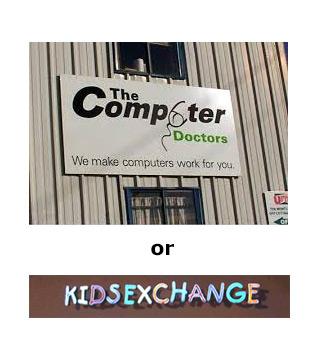
5) Can it be easily misinterpreted? We’ve seen some doozies of horror stories on this topic. Do you really want your logo to become a Facebook meme? These images should illustrate what I mean:

6) Is it adaptable and scalable? Overly complex logos become problematic not just because they create brain overload with customers, but also as soon as you need to fax, embroider, or print them in black and white.
8) Is it timeless? A well-designed visual identity is not like a Paris runway model’s dress and should not go out of fashion after a single season. Some of the best logos have remained virtually unchanged for decades.

So ask yourself, what does your brand currently say about your company and is it working hard to earn you that coveted “brand name premium?”
Sibyl Perkins serves as Brand Strategist and Chief Cat Herder at Sibyl Design. Sibyl espouses the philosophy that the best ideas come from building brain trusts of great people and cross-pollinating wherever possible. What she knows about design and brand strategy is a lot, and what she doesn’t, she will find out, always asking the right questions along the way. Sibyl has had a strong focus on developing great brands for craft brewers —allowing them to pay attention to the business of brewing quality beer while she brings her expertise to bear, giving them the brand tools needed to build a name and sell their products well.